Shaped brand content strategy and messaging across three T-Mobile prepaid brands, turning campaigns into clear, scalable web experiences for millions of customers.
Client
Metro by T-Mobile
T-Mobile Prepaid
Connect by T-Mobile
Year
2024 - 2026
Industry
Telecommunications
Format
Content Strategy
Brand Messaging
Copywriting
UX Copy / SEO
T-Studios
As Senior Copywriter on T-Mobile’s in-house creative studio, T-Studios, I owned brand and UX copy for Metro by T-Mobile, T-Mobile Prepaid, and Connect by T-Mobile. I partnered with designers, marketing, product, and legal to keep messaging clear, on-brand, and consistent from campaign to checkout.
Metro
Over two years, I restructured Metro's prepaid plans experience through three plan rebrands, reorganizing the plan taxonomy, rewriting content across 10+ web pages, and threading the brand narrative through the site, so customers could clearly compare plan options and sign up with confidence.
Metro's AND Campaign
50+ product placements, 10+ landing pages, and the main brand narrative page to keep messaging consistent for 20M+ Metro customers.
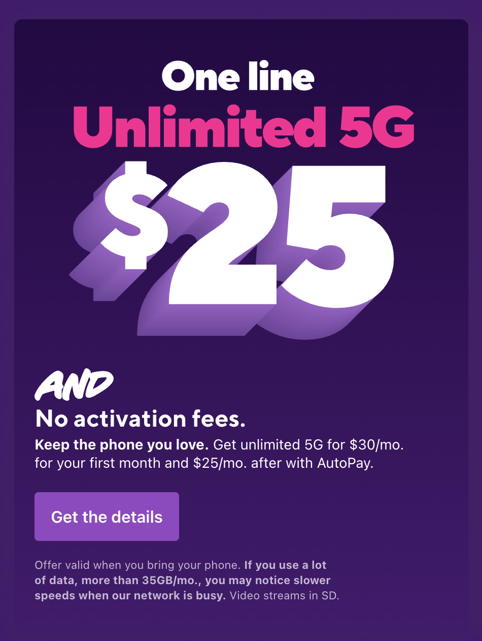
Refreshing the brand meant bringing its campaigns online. Metro’s AND campaign was built on its promise of more. In advertising copy, it could read:
One line Unlimited 5G $25
AND
No activation fees.
But what worked in advertising copy didn’t translate cleanly to the web. In this case, since “and” is a common word and the Spanish translation, “y,” the AND couldn’t be dropped across the site without rethinking the user experience.
I developed the web branding guidelines for AND, gathering input from marketing, product, and Spanish-language partners while owning the framework myself—then rolled it out across 50+ product placements, 10+ landing pages, and the main brand narrative page, keeping messaging consistent for 20M+ Metro customers.
Metro's Brand Page
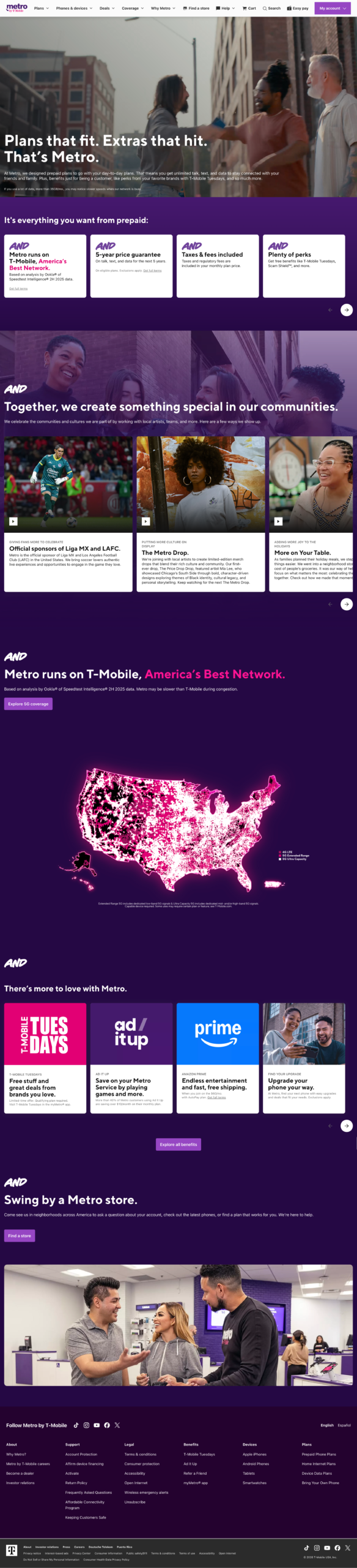
For example, I wrote Metro’s “Our Story” brand page, building the brand narrative around AND. I used the headline “Plans that fit. Extras that hit. That’s Metro.” as the anchor for the messaging—since AND is a connecting word, it only works when it builds on something. Then AND opened each following section, extending the promise of more one headline at a time.
AND turned the page into an accumulating story of everything Metro offers, reinforcing the promise of more through the page structure. Because I’d created the guidelines, I could walk stakeholders, including senior leadership, through how to use the campaign to extend Metro’s message of more.
T-Mobile Prepaid
FIFA World Cup
Built two landing pages and supporting ads for a projected 5M+ international visitors.
With a projected 5M+ international visitors traveling to the U.S. for the 2026 World Cup, many would need a way to stay connected the moment they landed.
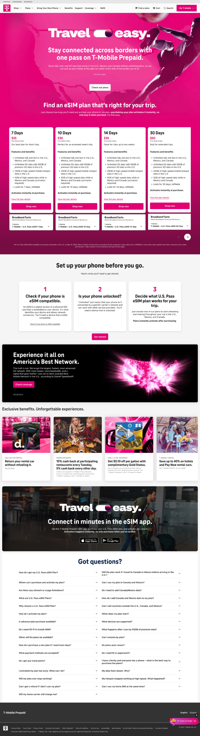
I owned the content strategy for T-Mobile Prepaid’s travel eSIM launch. I planned it as two pages with two jobs: a prelaunch page to build awareness and teach travelers what an eSIM even was before they could buy, and a launch page to convert them once plans went live. Splitting it that way meant the hard work of explaining an unfamiliar product happened early, so the launch page could focus on getting people signed up.
There was a catch: we couldn’t say “FIFA” (T-Mobile isn’t a sponsor), so the designer and I created a soccer-inspired look that echoed our paid ads. I partnered with product stakeholders to nail the details—like that the eSIM activates instantly—and made sure travelers saw why T-Mobile Prepaid beat other brands: with T-Mobile Tuesdays perks like prepaid rental-car gas, 10% cash back at certain restaurants, and up to 40% off hotels.